|
Here is the final design for our Production Company Logo. The title fonts have changed so that it gives a professional look, and some small Sound FX have been added so that the ident is interesting for an audience member.
0 Comments
This was the first cut for our Production Company Logo. It was designed on 'HitFilm Express' and it uses draft design No. 1 as inspiration, which was our 2nd highest vote. The transition between the bars to the Letter M gave our company a unique ident to others as it is memorable thanks to the transition, and the bars link to the word 'Wanted'. However, from feedback given the first title font needed to change because it looked too tacky and unprofessional, and some SFX needed to be added so that the ident doesn't look boring.
 These are the first initial ideas of the logo for our Production Company drawn by one of our group members Reece. We called the Production Company 'Wanted Media' because it links nicely into our court case narrative and it gets straight to the point of our film types. 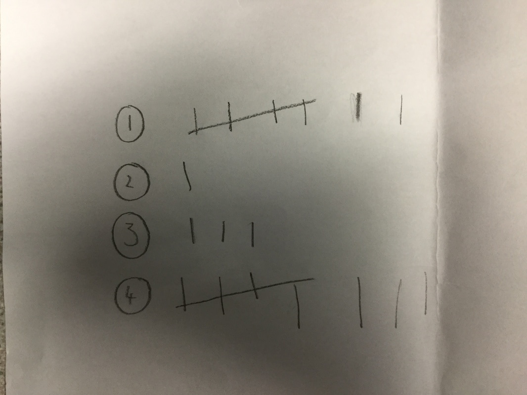 In addition to creating the drafts, Reece also did a survey with our Media Studies Class on what Production Logo they think is the best. As you can see, No.4 got the most with 8 votes whilst No. 1 came second with 7. Personally I prefer No.1 because it links to the word 'Wanted' with the prison bars design, compared to No.4 which looks stylish with the reflection but it does not capture the essence of our Production Company.
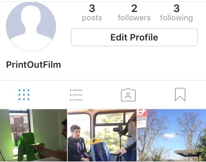 To establish a connection with our audience, we decided to create an Instagram account because Instagram has now 600 million users active and, unlike Facebook, Instagram has a focus on pictures, which is why many studios use it to market their upcoming films because audiences can now see BTS shots of an upcoming blockbuster movie.
To find our Instagram account, it is 'Print_Out_Film' |
BannerThis is a behind the scenes still from 'The Italian Job Archives
May 2017
Categories |
 RSS Feed
