 Here are the three final choices for my opening sequence analysis. The reason why I chose these three was because each one is different in how they present their titles. 'Mulholland Drive' is placed as one of the best mystery films ever made and has pre-credit scene before the titles along with Lynch's classic uncomfortable atmosphere. Rear Window is an old fashioned thriller and there is stark contrast in tone compared to the other two. Finally, I picked Memento as the introduction to this mind-bending narrative uses a limited number of camera shots and the film begins at the end.
However, if I have enough time, I would do the film 'We Need To Talk About Kevin' as well because the opening sequence borrows heavily from David Lynch as 'Mulholland Drive' and this film both use scenes and images that don't link with each other, creating ambiguity in the audience.
0 Comments
My chosen format for analysing my opening sequences is in Podcast. This is because I have been co-presenting a podcast for nearly a year called 'Fortnight In Film' with my friend Caleb Pinnell.  The reason why I chose Podcast form is because when it comes to analysing films, I sometimes prefer to get an opinion from another person as I can gain clearer insights into movies through their own understanding. Also, I prefer to speak out my views and judgements rather than writing them out in essay form as I don't feel constraint on how I phrase my arguments.
Below is a link to our youtube where we release our podcasts: https://www.youtube.com/channel/UCnz8GpzxL_qGa0A-U47_24g 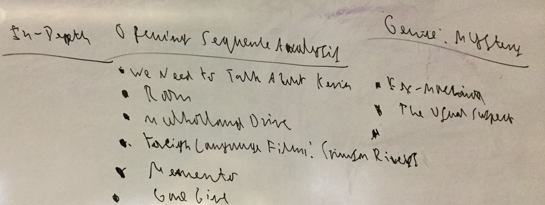 Here is a list of films that I am considering for analysis in their opening sequences. The genre that our group has chosen is Mystery and I have picked a list of films from IMDb that fall under the genre of Mystery, whilst also challenging myself by considering films that are out of my comfort zone like 'The Crimson Rivers'.
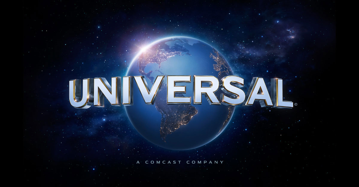 The logo and ident of 'Universal Pictures' shows that they literally have a universal audience. As a company they strive to have their films reach a worldwide audience, which can be seen through their logo with the words 'Universal' overshadowing a 3D spherical image of the Earth. As well as their company's ethos, most of their films have 'Universal' themes. For example, 'E.T: The Extra Terrestrial' (their 2nd highest grossing film of all time) is a family film that contains themes of family, friendship, and teamwork as Elliot and E.T. work together to bring E.T. home. Finally, as well as making films that are 'Universal', the company is also known to make big budget movies ('Jurassic World' is their highest grossing movie of all time) and their company ident helps them to maintain this reputation by making their ident 'epic' with the famous horn fanfare and the smashing timpani accompanying the word 'Universal' as it appears over the horizon and swirls around the world to create the iconic logo. In addition to the ident not being epic enough, when 'Universal Pictures' changed their logo in 2012, they also changed the ident slightly with the addition of a fully fledged choir singing their hearts out to the sight of the words appearing again. 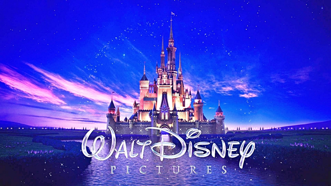 Unlike the Universal Logo, Walt Disney Pictures is aiming for a younger audience. 'Magic' is a key aspect of Disney's marketing and their logo is based around 'Magic'. The font is glittered with a gorgeous chrome that is pleasing to the eye and sparkles like fairy dust, linking to the well known character of Tinkerbell from 'Peter Pan'. The blue hues of the sea blend beautifully with the pinkish reds of the sky to create a fantastical sunset that is too perfect to be true, which plays into Disney's marketing of magic and believing in magic. Finally, the Cinderella Castle is the icon of Disney and by using it in their logo, it gives audiences This logo also links to the types of films that they show as most of their movies have some sort of fantasy element. Whether it is a 'Disney Pixar' film or a 'Walt Disney Animation Studios' production, most of Disney's movies accompanied by this logo will likely have some form of fantasy embedded in the narrative of the upcoming film. However as soon as audiences see this logo, they will think of 'Cinderella', 'Snow White and the Seven Dwarfs' and 'Beauty and the Beast' and other films related to Disney Princesses because of the Cinderella Castle, and so this is a reason why 'Disney' never show this logo before a Marvel or Star Wars film as it would demoralise the film into a Disney 'fun-for-all-the-family' movie and disrespect the fans in the process. 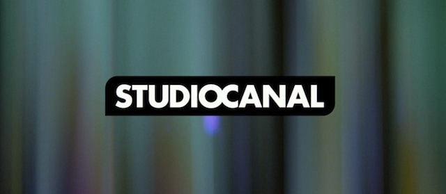 The logo for the French film production company 'StudioCanal' is a perfect example that you do not have to be flashy and stylish to make an effective logo. Although, their logo seems bland with no meaning behind it at first glance, there are some hidden meanings in the logo at a second one. Firstly, there is no separation between the words 'Studio' and 'Canal' with the 'O' and 'C' linking together showing that the two things are the same, which is true in real life because the company is a unit of the 'Canal+ Group', owned by 'Vivendi'. Secondly, the squared border has changed with two curved corners symmetrically placed opposite each other, which gives the impression that the company are different to other production companies by changing a simple formula like square borders. However, for me, the ident is what makes this logo stand out the most to other ones. From a statement by UK agency 'Devilfish', creators of the ident, they say that the ident revolves around the concept of the 'interplay between light and glass': light being the common denominator of cinema, and glass representing the lens of both the camera and the cinema projector. The strange glass panels spinning around with light changing and colours moving represents StudioCanal's vast library of films (their film library is the third largest in the world). The abstract light generated from the logo of StudioCanal and projected through the glass panels creates an effect of surrealism in the audience. Finally, compared to the loud emotional orchestral scores used by Disney and Universal for their idents, the music used in StudioCanal's ident is subtle and suggests an artistic vision with the types of films that the company distribute like 'Youth' and 'Carol'. In recent years, 'Lionsgate Films' has become a leading company in production and distribution thanks to box office successes like 'The Hunger Games', 'Divergent', and 'La La Land' and their logo helps to establish them with their new status as independent film logo ideas are blended with studio film ones. The epic backdrop of clouds evokes the backdrop of the 'Universal Pictures' as 'Lionsgate' metaphorically places themselves up amongst the gods. The title is bordered by a white highlight and has a 3-D shaped curve in the font so that it stands out from the background, and the orange highlights shining through the logo are to reference the old ident where the clockworks open up two grand orange doors to reveal the old 'Lionsgate Logo'.
As well as the studio logo influences, their independent roots can also be seen. For example, the font looks like it has been steel plated which references the word 'gate' and so the logo has its own identity. Also, the name 'Lionsgate' does not seem natural as both words 'Lion' and Gate' are two different things (one is an animal, another is a steel object) so audiences may find it hard to connect with the company's title. Finally, the cloud backdrop may be referring to the type of films that they produce and distribute as clouds can be connotations of dreams, which makes their films seem like escapism into flights of fantasy (e.g. 'La La Land' is an escape into a idealist version of Los Angeles). |
BannerThis is a behind the scenes still from 'The Italian Job Archives
May 2017
Categories |
 RSS Feed
