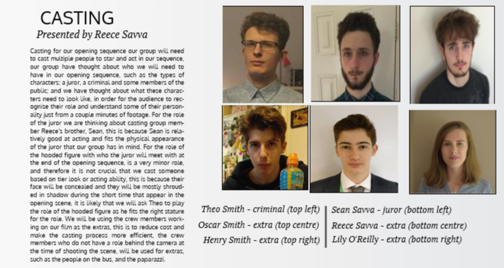
|
For posts on production such as music composition, rough cut analysis, behind the scenes evaluation videos, and the behind the scenes blog, you can find it under the Research and Planning 2 page and under the Production page.
0 Comments
Here is the final design for our Production Company Logo. The title fonts have changed so that it gives a professional look, and some small Sound FX have been added so that the ident is interesting for an audience member.
This was the first cut for our Production Company Logo. It was designed on 'HitFilm Express' and it uses draft design No. 1 as inspiration, which was our 2nd highest vote. The transition between the bars to the Letter M gave our company a unique ident to others as it is memorable thanks to the transition, and the bars link to the word 'Wanted'. However, from feedback given the first title font needed to change because it looked too tacky and unprofessional, and some SFX needed to be added so that the ident doesn't look boring.
 These are the first initial ideas of the logo for our Production Company drawn by one of our group members Reece. We called the Production Company 'Wanted Media' because it links nicely into our court case narrative and it gets straight to the point of our film types. 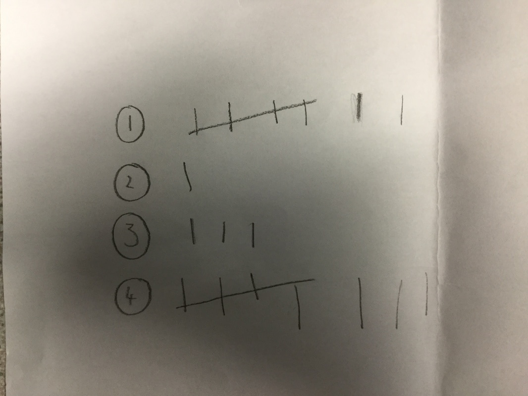 In addition to creating the drafts, Reece also did a survey with our Media Studies Class on what Production Logo they think is the best. As you can see, No.4 got the most with 8 votes whilst No. 1 came second with 7. Personally I prefer No.1 because it links to the word 'Wanted' with the prison bars design, compared to No.4 which looks stylish with the reflection but it does not capture the essence of our Production Company.
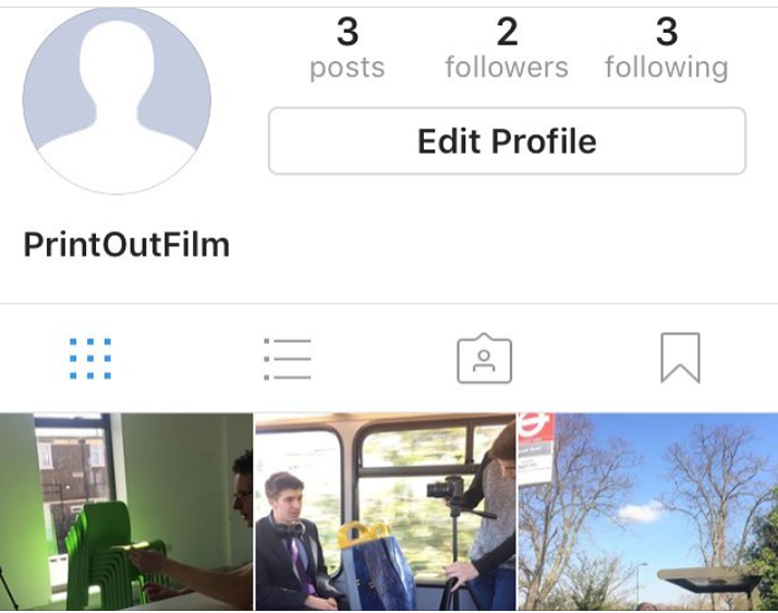 To establish a connection with our audience, we decided to create an Instagram account because Instagram has now 600 million users active and, unlike Facebook, Instagram has a focus on pictures, which is why many studios use it to market their upcoming films because audiences can now see BTS shots of an upcoming blockbuster movie.
To find our Instagram account, it is 'Print_Out_Film' 
Lily, in our group, redrafted the pitch on the website Emaze and the results are immediate. The layout matches the newspaper theme and the title 'Print Out'. The added boxes containing details of production schedule, make-up, and casting, makes the pitch look neatly refined in certain areas. Finally, the smooth transitions between each slide allows the pitch to flow effortlessly throughout rather than the jaded sudden appearances of slides in 'Microsoft Powerpoint'.
For my music choices, I decided to create a video and talk about my music choices using 3 examples and playing the music over my explanations.
Compared to my first episode of 'Sunday Corner', the video quality was only 360p compared to 720p. In addition, because I edited the video in one take, there were many times when I 'umm' and 'err' a lot, which does not look professional. Finally, the sound mixing between the music tracks were not great because my voice is sometimes drowned by the music playing in the background. However, after trying this method for two videos, it's proven to be a useful tool in allowing myself to bring my thoughts in a clear and concise manner and I plan to create more of these videos in the near future. 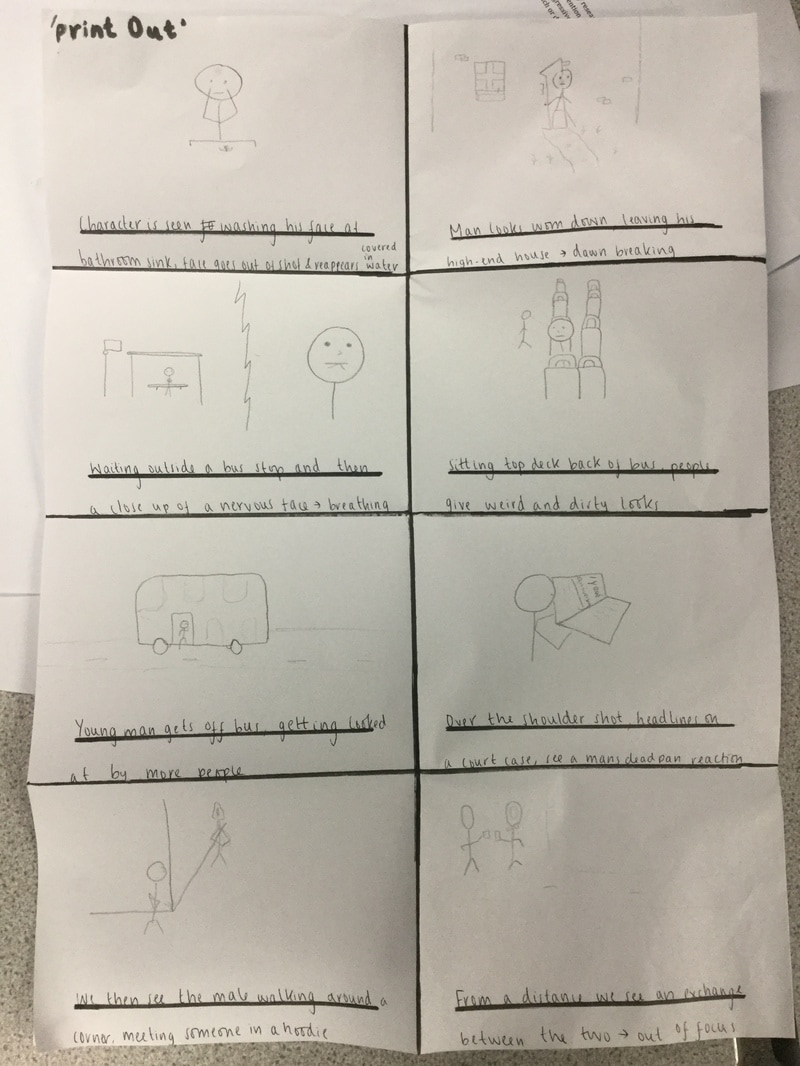 Our group member Lily drew up a sketch for a storyboard. Although our group agreed that the artistry was not amazing, it was still useful for us to see a first draft of some of the shots that we will film for our opening sequence. However, this storyboard would not be useful as a final draft because of the unfinished drawings and it is hard to differentiate shot types. 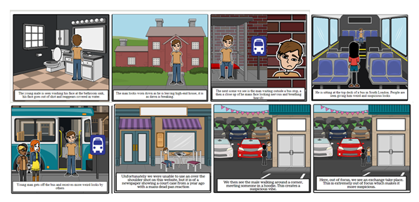 Lily then created an animated storyboard, and the boards had more clarity because of the added colours and the 3D animations.
|
BannerThis is a behind the scenes still from 'The Italian Job Archives
May 2017
Categories |
 RSS Feed
